
Goodreads App Redesign
PROJECT DESCRIPTION
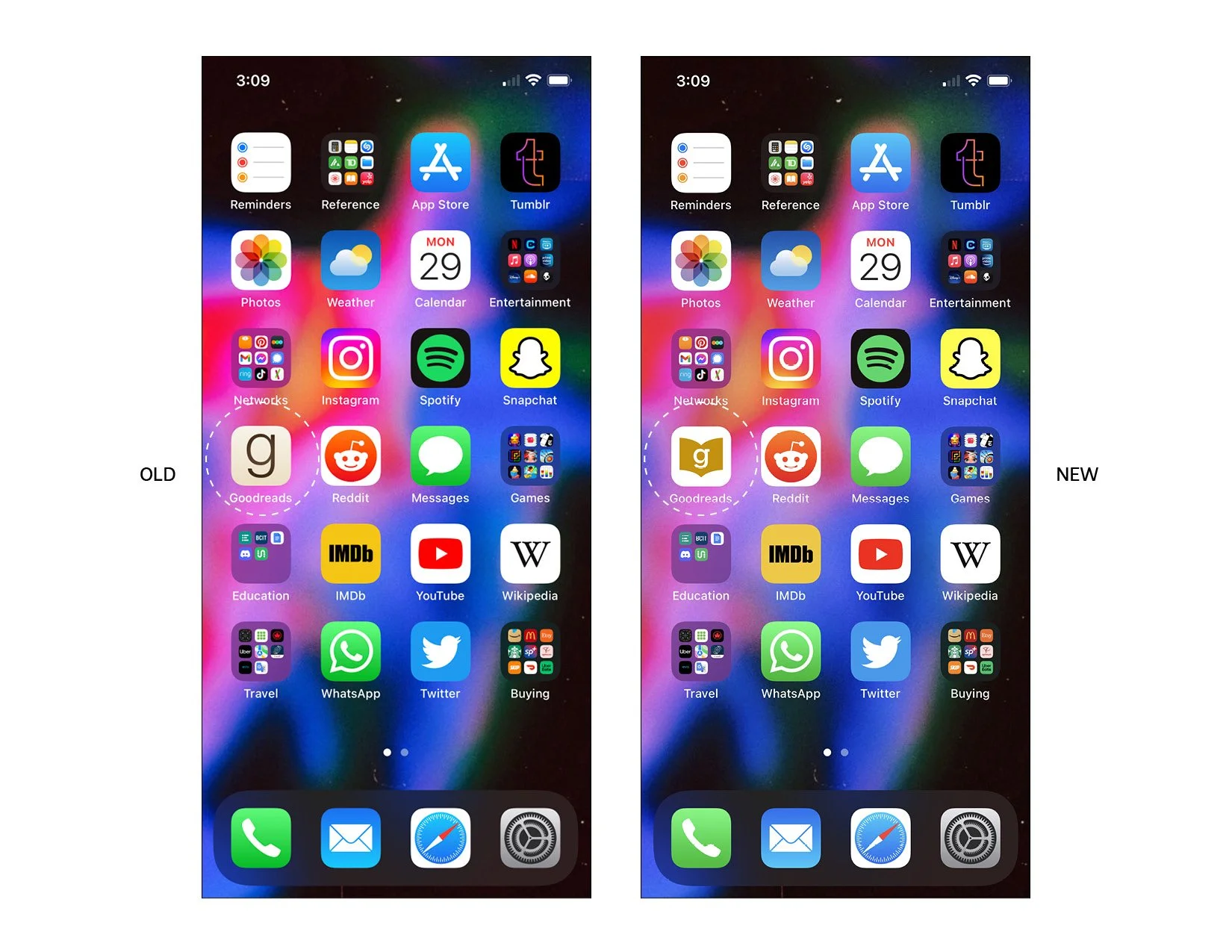
ASSETS: LOGO, ICONS, APP UI.
For this case study, I decided to try redesigning an app that I felt could use a facelift–Goodreads. The Goodreads app is one that I use frequently; I like cataloging and keeping track of the books I read and want to read; I also enjoy seeing the books my friends are reading and rating. It is also good for my motivation to read more and finish books. I compared it a lot in this case study to another media cataloging app– letterboxd, which is like Goodreads but for movies. Letterboxd is a lot more attractive than Goodreads; it places more focus on crafting a profile, interacting with other members, reading/writing reviews, and curating your own lists. Letterboxd also has a better profile system; the user gets to choose and display their four favourite movies so that friends and followers get a snapshot of other user’s tastes.
The main problems I addressed with the Goodreads app are as follows:
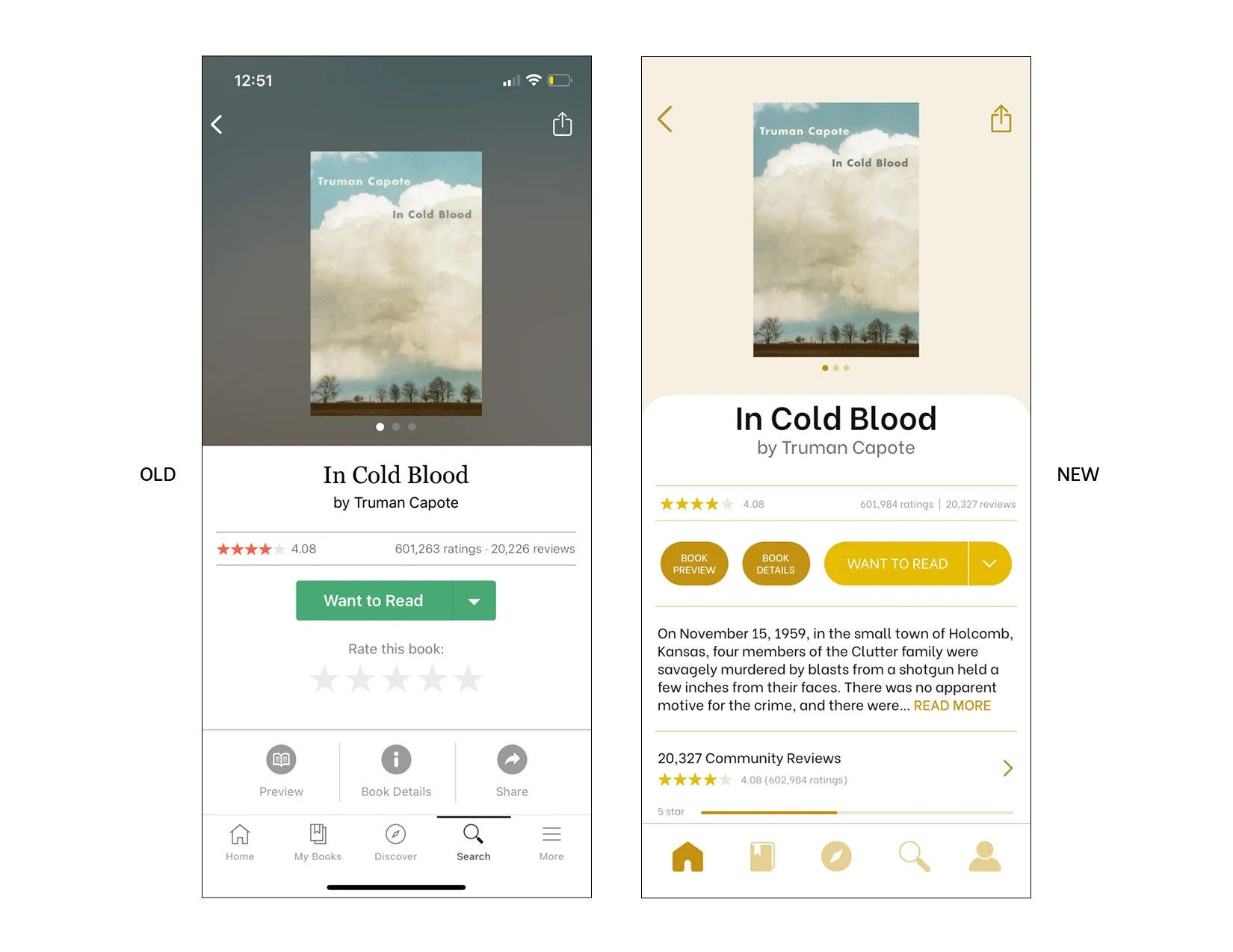
1) Outdated, lackluster look with lifeless & boring beige colours
2) Lack of personality with fonts & graphics
3) Bad hierarchy, less used and/or important elements emphasized in some cases
4) Some features take getting used to (and even then, I still sometimes forget where to do what). So ease of use in some instances could be improved.
Some of the aesthetic changes I made were changing the main colour from dull beige to a more saturated dark gold, I removed extraneous colours, improved hierarchies, made some icons more relevant, simplified layouts to highlight the most used elements, and overall update the look of the interface to be more clean, contemporary, and useful. For this project I used Xd, Illustrator, and Photoshop.
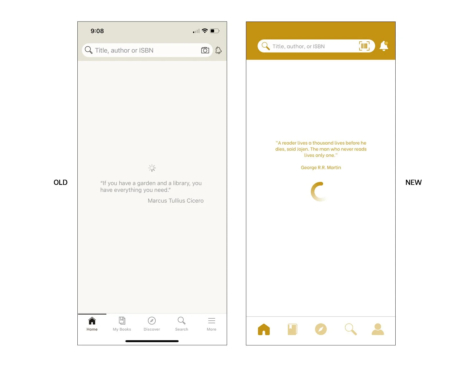


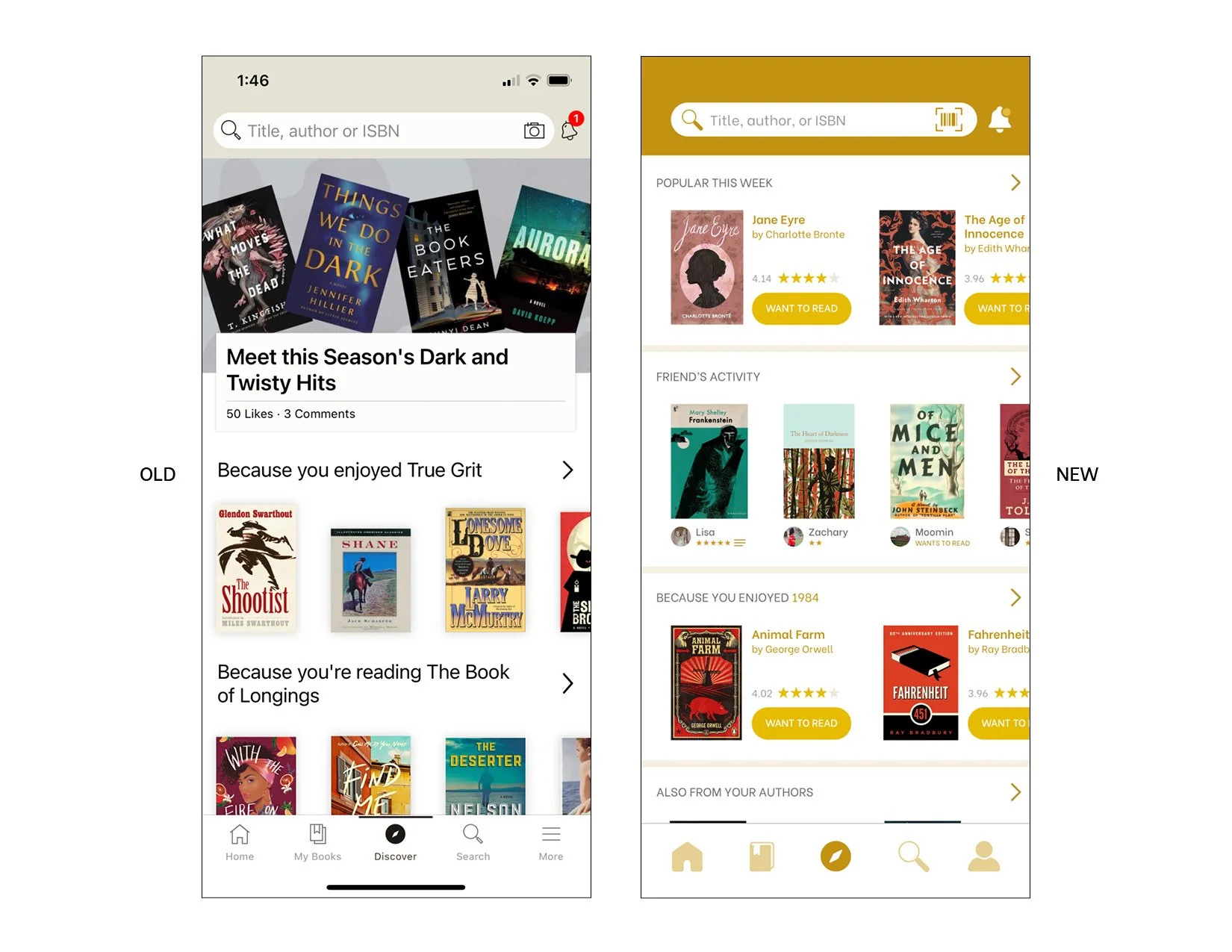
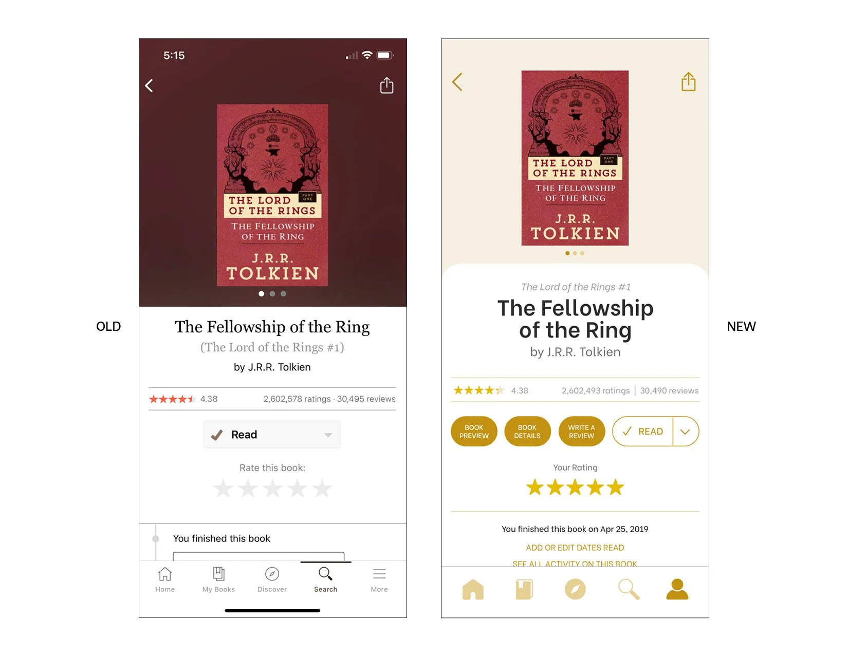


APP PROTOTYPE
To top it all off, I designed a billboard ad to launch the new look of the app.